Working with Graphs
Using tools on the Charts tab, you can create the following types of charts to illustrate data trends, compare values, or show a progression.
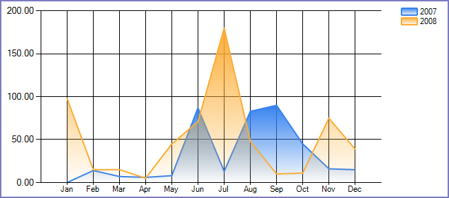
Trend Charts
Use a trend chart when you want to view the pattern of change in a data element over a period of time.
Figure: Trend Chart Example
To create a trend chart
Open the ad hoc report writer portlet (see Launching the Ad Hoc Report Writer) and either click the Edit icon for an existing report, or click Design a New Report.
If you are designing a new report, select one or more data sources. See Data Source Section and DB View Relationships Section.
Go to the Charts tab.
From the Chart Type drop-down list, select Trend.
Enter a title for the chart in the Title field.
Select the date field you want to use for measuring progress on the x-axis.
Select an option from the Function drop-down list to apply to the date field. For example, choose Group(Month Name) to display data by month.
Note:The Function options can impact your x-axis unit labels. For example, if you choose Group(Month), the x-axis labels display numerical values representing the months of the year (1 for January, 2 for February, and so forth). If you choose Group(Month Name), the x-axis labels display the abbreviated names of the month (Jan for January, Feb for February, and so forth).
Select Sort to sort the values chronologically. If you do not check this box, the field labels may not appear as you expect them to.
From the Value drop-down list, select the field you want to use for the y-axis. Your selection is the value you want to track over time. For example, if you want to track the amount of payments received over time, you can choose the Amount field.
Select an option from the Function drop-down list to apply to the Value you just selected. For example, you can choose Sum to sum the data for the Value field for each period of time defined by the Date function.
Optional: Click Advanced Properties to see additional chart settings.
Complete additional chart attributes as described in Trend Chart Fields and Settings.
Either save your work, or click Continue to Gauge.
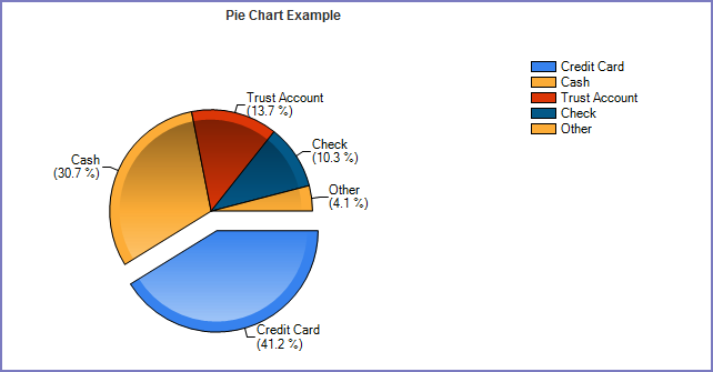
Pie Charts
Use a pie chart when you are comparing parts of a whole. The circle represents the “whole,” whereas each ‘slice’ of the pie corresponds to a percentage of the whole that each part of the whole represents.
Figure: Pie Chart Example
To create a pie chart
Open the ad hoc report writer portlet (see Launching the Ad Hoc Report Writer), and either click the Edit icon for an existing report, or click Design a New Report.
If you are designing a new report, select one or more data sources. See Data Source Section and DB View Relationships Section.
Go to the Charts tab.
From the Chart Type drop-down list, select Pie.
Enter a title for the chart in the Title field.
Enter a number in the Records field to limit how many records you want to use to create the chart.
Select a field from the Label drop-down list. Civic Platform uses the values from this field to define the different portions of the pie chart.
For example, you want to create a pie chart that shows the percentage of total payments for each of five payment methods. You can use Payment_Method as the label.
Select an option from the Function drop-down list to apply to the Label field (for example, Group).
Select a field from the Value drop-down list.
For example, you want to measure the percentage of total payments for each of five payment methods. You can use Amount as the Value.
Select an option from the Function drop-down list to apply to the Value field (for example, Sum).
Optional: Click Advanced Properties to see additional chart settings.
Complete additional chart attributes as described in Pie Chart Fields and Settings.
Either save your work, or click Continue to Gauge.
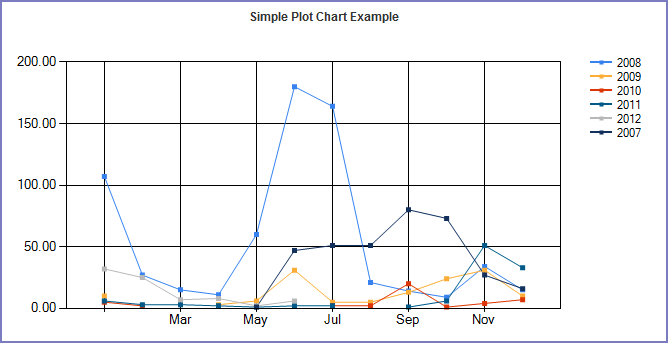
Plot Charts
Use a plot chart when you are tracking changes over a long or short period of time. It is common to apply a date or time value to the x-axis, and a secondary value, such as number of inspections per day, to the y-axis.
Figure: Plot Chart Example
To create a plot chart
Open the ad hoc report writer portlet (see Launching the Ad Hoc Report Writer), and either click the Edit icon for an existing report, or click Design a New Report.
If you are designing a new report, select one or more data sources. See Data Source Section and DB View Relationships Section.
Go to the Charts tab.
From the Chart Type drop-down list, select Plot.
Enter a title for the chart in the Title field.
Enter a number in the Records field to limit how many records you want to use to create the chart.
Choose a field to use for the x-axis values. Users often choose a date field.
From the drop-down list, choose a function to apply to the field you just selected (for example, Group).
Choose a field to use for the y-axis values.
From the drop-down list, choose a function to apply to the field you just selected (for example, Sum).
Optional: Click Advanced Properties to see additional chart settings.
Complete additional chart attributes as described in Plot Chart Fields and Settings.
Either save your work, or click Continue to Gauge.
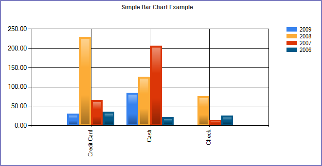
Bar Charts
Use a bar chart when you want to compare data between different groups or you want to track changes in data over time.
Figure: Bar Chart Example
To create a bar chart
Open the ad hoc report writer portlet (see Launching the Ad Hoc Report Writer), and either click the Edit icon for an existing report, or click Design a New Report.
If you are designing a new report, select one or more data sources. See Data Source Section and DB View Relationships Section.
Go to the Charts tab.
From the Chart Type drop-down list, select Bar.
Enter a title for the chart in the Title field.
Enter a number in the Records field to limit how many records you want to use to create the chart.
From the Label drop-down list, choose a field to use for the x-axis values. Users often choose a date field.
Choose a function to apply to the field you just selected (for example, Group(Month)).
From the Value drop-down list, choose a field to use for the y-axis values.
Choose a function to apply to the field you just selected (for example, Sum).
Optional: Click Advanced Properties to see additional chart settings.
Complete additional chart attributes as described in Bar Chart Fields and Settings.
Either save your work, or click Continue to Gauge.
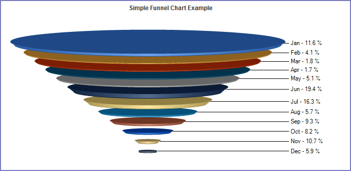
Funnel Charts
Use a funnel chart to illustrate a sales analysis of potential revenue over a series of stages.
Figure: Funnel Chart Example
To create a funnel chart
Open the ad hoc report writer portlet (see Launching the Ad Hoc Report Writer), and either click the Edit icon for an existing report, or click Design a New Report.
If you are designing a new report, select one or more data sources. See Data Source Section and DB View Relationships Section.
Go to the Charts tab.
From the Chart Type drop-down list, select Funnel.
Enter a title for the chart in the Title field.
Enter a number in the Records field to limit how many records you want to use to create the chart.
From the Label drop-down list, choose a field to use for the x-axis values. Users often choose a date field.
Choose a function to apply to the field you just selected (for example, Group(Month)).
From the Value drop-down list, choose a field to use for the y-axis values.
Choose a function to apply to the field you just selected (for example, Sum).
Optional: Click Advanced Properties to see additional chart settings.
Complete additional chart attributes as described in Funnel Chart Fields and Settings.
Either save your work, or click Continue to Gauge.