New Form Designer
Topics
Features of the New Form Designer
The new Form Designer includes these enhancements from the previous form designer.
- Form Designer switch button - Switch between the new Form Designer and the old Form Designer.
- Grid layout - A more intuitive layout tool that snaps the form elements to a specific grid for a more uniform look.
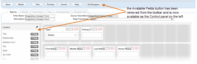
- Control panel - The Available Fields button is now an intuitive Control panel that is always accessible.
- Modal windows - Available options for preferences and previewing the form now appear as a modal window in the window you are working in rather than a pop-up window.
- Element control buttons - Easily rearrange and edit the available elements with the control buttons on each one.
- Element icons - Some elements now have icons that show their function to your users on the form.
Accessing the New Form Designer
Forms that are enabled with the new Form Designer display with a New Form Designer button on the toolbar.
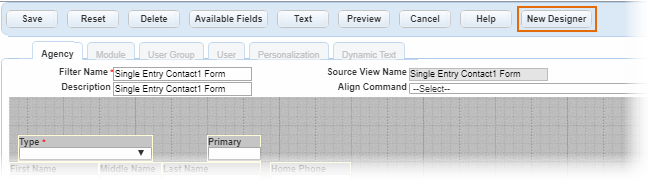
To access the new Form Designer, click the New Form Designer
button ( ) in the upper right corner of the Form Designer
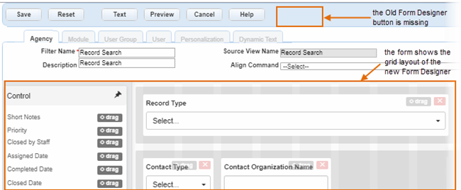
toolbar. To get back to the old Form Designer, click the Old Form
Designer button (
) in the upper right corner of the Form Designer
toolbar. To get back to the old Form Designer, click the Old Form
Designer button ( ) on the toolbar.
Grid Layout
The new Form Designer layout has 12 grids that define the shape of all of the available fields and elements. Each element automatically snaps to one of the 12 grid slots, making a more uniform appearance for all the forms. An improvement from the last designer is that if you overlay any element on top of another, whether by moving it or resizing it, the field that was in that spot automatically shifts over to allow the new field. No fields can be on top of another, eliminating the error when trying to save the form.
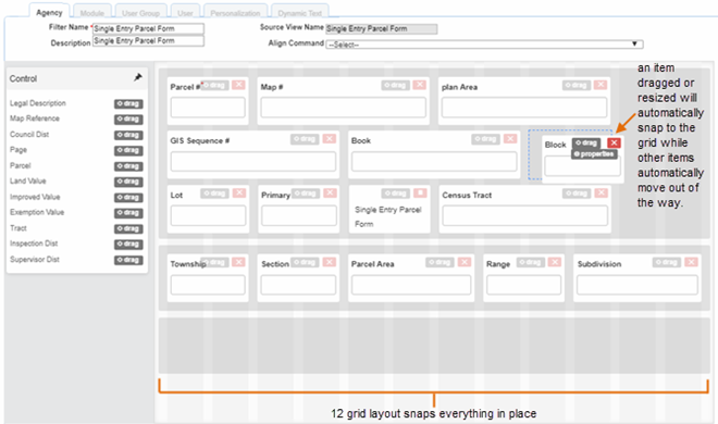
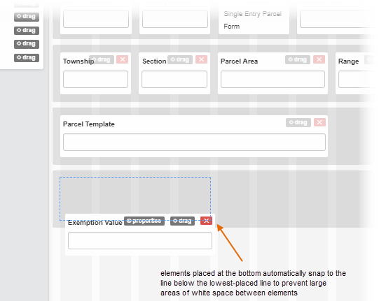
If you want to add something to the bottom of the screen, the grid also prevents large areas of white space from appearing at the bottom of the form by automatically aligning the added element to the previous lowest element. You can, however, have as many lines as elements are available for a form. You are not limited by the vertical height as you were with the old designer.
Control Panel
You may notice that the Available Fields button on the toolbar is missing in the new Form Designer. This is now a Control panel that scrolls with the page as you are designing the form.
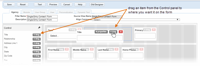
Add elements from the Control panel to the form by dragging it over to the available grids (click and hold the drag button).
Remove elements from the form by clicking the delete button ( or
or  ) on the
element.
) on the
element.
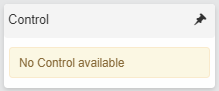
If you use all the fields available in the Control panel, the panel informs you that no other controls are available to add.
If you remove all the fields from the form, the list may get too long to scroll with
the page. Click the pin ( )at the top right corner of the Control panel to unpin it.
When it is unpinned, the list available will scroll with the page so that you can
view additional items on the list.
)at the top right corner of the Control panel to unpin it.
When it is unpinned, the list available will scroll with the page so that you can
view additional items on the list.
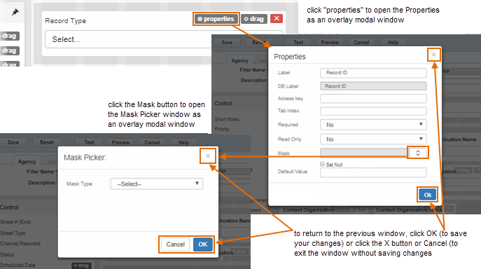
Modal Windows
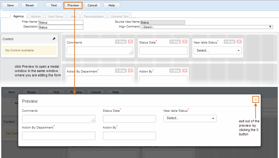
Previously, when editing field properties in the old Form Designer, a Field Properties window displayed for administrators to edit. Because this and any other options were separate windows, it could be a confusing and cumbersome process. With the new Form Designer, the properties open as pop-ups in the same window where you are editing forms in the order that you clicked them. You must now click OK, Cancel, or the X button (which acts like the Cancel button) to return to the form being edited.
To preview the form with your changes, click the Preview button on the toolbar.
To access the properties of an element, hover over it, then click Properties.
The new designer keeps any pop-up information within the same page so that there's no confusion on which windows need to be confirmed before being able to continue edits on the form.
When you finish editing the properties of an element, it flashes briefly with a blue border to indicate where it appears on the form.
Element Control Buttons
| Button | Image | Description and Use |
|---|---|---|
| Delete (for database-controlled elements) | |
This used to be on the main toolbar for the form designer.
Now you will find the delete button on each element. Once these
elements are removed, they return to the Control panel. Note: Not
all elements can be removed from a form. Some are required
based on the type of form it is.
|
| Delete (for dynamic labels) | |
This used to be on the main toolbar for the form designer. Now you will find the delete button on each element. This icon is used only for dynamic (text) labels, which are not controlled by the database. These are completely removed from the form (not returned to the Control panel) when you click the delete button. |
| Drag |  |
Each element has a clear drag button to move them around on the grid. |
| Properties |  |
Before, you had to double-click an element to pull up the properties. Now you can hover over an element to get the properties button. Click this button once to open a modal window on the screen to edit the properties. |
| Resize height |  |
This option only shows on the Notes or Comments element,
which is the only element that can have its height resized. Use
this control to change the height of the Notes field on a form
by clicking and holding the double lines and pulling the height
to the desired size. Note: This handle does not resize in
Internet Explorer. The Notes field is fixed at two rows
height when set in this browser.
This handle appears as an icon for general text fields such as Comments. |
Element Icons
| Icon | Image | Description and Use |
|---|---|---|
| Calendar |  |
This icon indicates a calendar where your users can select a date instead of entering one. |
| Text fields | |
This icon shows for general text fields, such as comments. For the Notes field, it is also an adjustable height button. |
| Menu lists |  |
This icon shows when the option is a drop-down menu list. |