Understanding SmartCharts
SmartCharts provide graphical representations of queried data that enable managers to filter and review specific items, such as new permits this quarter or the number of permits on hold this month in comparison to each of the previous six months. You can restrict SmartChart access to individual users or user groups.
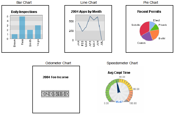
You can create the following types of SmartCharts (SmartCharts):
Column bar chart. Plots two sets of data values. The set of data values shown on the y axis must be numeric. The set of data values on the x axis can be numeric or alphanumeric.
Line chart. Plots two sets of data values. The set of data values shown on the y axis must be numeric. The set of data values on the x axis can be numeric or alphanumeric.
Pie chart. Plots two sets of data values. The y values determine the percentage each chart section occupies. The x values determine the labels for the sections.
Odometer chart. Plots a single set of data values for which you want to maintain a count.
Speedometer chart. Plots a single set of data values on a speedometer. You define ranges (Start, Warning, Critical, and End).
Figure: SmartCharts