Ad Hoc Reports Button and Field Reference
Whether you are creating a new report or a new dashboard, or accessing an existing report or dashboard, you use the ad hoc report writer. The topics in this section describe what you see both on the Report List page and on the Report/Dashboard Designer.
Topics
What You See on the Ad Hoc Report Writer List
When you first open the ad hoc report writer, you see a display called the Report List. The display contains both a report list (organized by category), and hyperlink commands to design a new report and a new dashboard, as shown in the figure below. Clicking either of the Design hyperlinks opens the Report/Dashboard Designer.
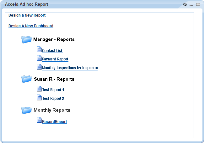
The categories, or folders, are user-defined, and you can decide which reports or dashboards to assign to a category. Click any category to expand or collapse the contents.
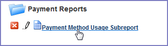
Each report in the list has a set of tools you can use to interact with that report. Which tools you can use on a given report depends on your User ID permissions to that report.
To see the toolbar for a report, hover your mouse cursor on the report name in the Report List. The report tools display to the left of the report name as shown in the figure below.
| Button | Control Name | Description |
|---|---|---|
 |
Delete | Click this button to delete the report. |
 |
Edit | Click this button to edit the report. The Report Designer opens. |
| Report Name | The report name is a hyperlink. When you click the name, the report runs and then displays. |
What You See on the Report Designer
The Report Designer provides users with a series of tabs that divide the report building tasks into logical groupings.
Descriptions of the Reports Designer toolbar, the common record controls, the data source sections, and the Report Designer tabs are available in the following sections.
Topics
Report Designer Toolbar
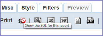
A common element to all the tabs on the Report Designer, the toolbar contains a series of buttons you can use while working in Report Designer.
Hover your mouse cursor over any button to see a brief definition of the button’s function. If the button is not active for any reason, Civic Platform displays a ‘no access symbol,’ as illustrated in the example below.
For additional reference, see Izenda's Toolbar documentation.
The following table lists and defines the buttons available in the Report Designer toolbar:| Button | Control Name | Description |
|---|---|---|
 |
Report List | Returns user to the Report List page. If you did not save your report, you may lose your work. |
 |
New | Creates a new report (without having to return to the Report List page). If you have been working on another report, remember to save your changes before clicking New. |
 |
Save | Saves a new report or saves changes to an existing report. |
 |
Save As... | Saves a report with a new name, or an existing report to another category, or a new category (see Creating a New Category). |
 |
Prints your report to PDF. For a hard copy, you can print the PDF to your printer. | |
 |
SQL | Displays the SQL logic that defines your report. |
 |
CSV | Exports the report to CSV (comma delimiter) format. |
 |
Excel | Exports the report to Excel (XLS) format. |
 |
Word | Exports the report to Word format |
 |
XML | Exports the report to XML format. |
 |
RTF | Exports the report to Rich Text Format (RTF). |
| Results field | Defines the number of records to display when previewing a report. |
Record Control Buttons
Many of the tabs share record controls that give you the ability to add additional records, as well as delete and reorganize them. The following table lists and describes those controls.
| Button | Control Name | Description |
|---|---|---|
|
Delete | Deletes the row the button is on. |
 |
Insert Row (above) | Inserts a row above the row that the button is on. |
 |
Insert Row (below) | Inserts a row below the row that the button is on. |
 |
Move | Moves a row up or down in the list. |
 |
Advanced Properties | Opens advanced properties for a row. (Not available on all tabs) |
Data Source Section and DB View Relationships Section
Use the Data Source (Views and Tables) page to define which tables (DB_Views) you want to use to populate data in your report. You can select one or multiple data sources. You can also select templates that give you access to sets of customs fields/attributes configured for a record, a workflow task, an address, a parcel, an owner, a condition, a licensed professional, or a contact for the agency.
When you select more than one data source, Civic Platform prompts you to create joins between the tables using the DB View Relationships section. A ‘join’ is when you combine records from multiple tables by using a common value that the tables share. You can choose the type of join you want to use. Options include inner joins, cross joins, and outer joins (left, right, and full).
Your administrator defines which data sources are available to each user. He can use Report Manager to enable data access to each DB_View, both by User Group and by Module.
For additional reference, see Izenda's Data Sources Tab documentation.
The following table describes the buttons and fields available on the Data Source (Views and Tables) page.
| Button/Field | Description |
|---|---|
| Report List | Returns user to the list of Accela ad hoc reports. |
| Add Fields | Enabled after you define one or more data sources. Use to move on to the next step in your report creation process: field selection and field definition. |
| Allow Nulls | Creates a left outer join between the tables. When you do this, the report creates a record for the value in the left-most table, whether there is a record in the right table or not. |
| Distinct | This option duplicates from the result set. When you select this option, Civic Platform inserts the DISTINCT clause into the sql SELECT statement you are building. After you select fields in the Fields tab, you can click SQL to see how the DISTINCT clause appears in the SELECT statement that you are creating. |
| Name column | Indicates the name of a data source. Select each data source that you want to use for reporting. If you specify multiple data sources for reporting, you need to create joins between the data sources. |
| Description column | Provides a description of a data source. |
| Number of Selected Templates column | Indicates the number of templates that you choose to include in your data source for reporting. You can select the additional information fields contained in the selected template and define them as report criteria. |
 |
If templates (sets of customs fields/attributes) are available for a data source, this button displays in the Template column. It displays a template selection list for the selected data source. For more information, see Adding Templates to Your Data Source. |
Fields Tab
Use the Fields tab to define which fields you want to include in your report. The list of fields available to you depends on the data source(s) you select in the DB View Relationships section.
Each field you add on this tab appears as a column on the report. The order of the fields from top to bottom determines the display order (left to right) of the data columns on the report. For example, if you add RECORD_ID, followed by DATE_OPENED, and DATE_CLOSED in the Fields tab and then click Preview, you see three columns of data displayed. The columns, from left to right, are Record ID, Date Opened, and Date Closed.
After you select a field, you can define how the data for that field displays in the report by setting field attributes as described in the following tables.
For additional reference, see Izenda's Fields Tab documentation.
Field Tab Tables
Fields, Buttons, and Basic Field Attributes on the Fields Tab
- Advanced Field Attributes
Format Options for Date field types
Table 5. Fields, Buttons, and Basic Field Attributes on the Fields Tab Attribute Description A This attribute for a given field uses an arithmetic operation to create a calculated column in your report, such as column A = column B + column C. Click multiple times on the box to cycle through the available operators (add, subtract, multiply, divide). See Creating a Calculated Column for information. Add Pivot Invokes the Pivot feature, which enables you to create a breakout of additional detail on data in your report, essentially adding extra ‘pivot columns’ to the right side of your report. For example, you create a report that lists the sum of payments by payment type. You can use Pivot to add additional columns that break out the payment sums by month in addition to the original sum of payments by payment type. See Adding a Pivot Column for more information. Add Subtotals Creates sub-totals when you have applied visual grouping. A subtotal for each group displays. The ad hoc report writer makes a best guess at which field is to be sub-totaled and the function to use. If you want to change the subtotal function, use the Subtotal Function drop-down list in the Advanced Attributes to choose the function you want. Continue to Summary After you define one or more data sources and then set up the fields you want to display, this button becomes active. Use it to move on to the next step in your report creation process: defining a report summary. Description The ad hoc report writer uses this field attribute as the column header in the report. When you select a field, the ad hoc report writer writes a default description to this box. You can modify the field description/column header as needed. Field The field(s) you are adding to your report. The order in which fields appear on this tab (top to bottom) is the order in which the ad hoc report writer displays field data (left to right) in columns when you run the report. This drop-down list auto-populates based on the data source(s) you define. Format This field attribute defines how you want the data for a given field to display. The contents of this attribute drop-down list varies, depending on the field type. For text fields, this list is empty. For number fields, you have a variety of options. See Format Options for Numerical field types and Format Options for Date field types for formatting options. Function This field attribute applies a function to a given field. If you apply a function to one field, you must apply a function to all the fields in your report. If you select the Group option, you can create a group of fields. See Function Attribute Options for available Function options. Preview Shows a preview of the report you are creating. Records field This restrict the number of records returned when you preview the report. For example, if you enter 25 and then click Preview, your report displays only 25 rows of data. Sort This sorts the rows in your table in ascending order based on a given field. To sort rows in descending order, go to Advanced Field Settings. VG This changes the field values for the current field into subheadings, grouped by field value. See Visually Grouping by Field Value for more information about using visual grouping. Hide Grid Hides or shows table grids for report styling. Remove All Removes all fields from the report in the Viewer.
For descriptions of the advanced field attributes, see Izenda's Advanced Field Settings.
| Function Name | Description |
|---|---|
| Group | Groups field values together for aggregating |
| Count | Counts the number of values in a column. |
| Count Distinct | Counts the number of distinct values in a column. |
| Sum | Sums the value in a field. |
| Average | Takes the average value of a field. |
| Maximum | Takes the maximum value in a field. |
| Minimum | Takes the minimum value in a field. |
| Group(Date),(Day), (Month),(Year) | Groups a date field by value. |
| Format Option | Description | Examples |
|---|---|---|
| 0,000 | Displays the number as a whole number. | 11231,2341,234,567 |
| $0.00 | Displays the number as currency | $123.45$0.12 |
| 0.0 | Displays the number with one decimal place | 123.5 |
| 0.00 | Displays the number with two decimal places | 123.46 |
| 0.000 | Displays the number with three decimal places | 123.456 |
| 0% | Displays the number as a percentage | 1%12% |
| Format Option | Description | Examples |
|---|---|---|
| Short Date | Displays the date using the mm/dd/yyyy format | 8/1/1996 |
| Long Date | Displays the day of the week, month, numeric day, and the year | Friday, August 09, 1996 |
| Short Time | Displays time as hh:mm AM/PM | 12:34 AM |
| Long Time | Displays time as hh:mm:ss AM/PM | 12:34:56 PM |
| Full(short) | Displays the Long Date format, followed by the Short Time format | Friday, August 30, 1996 4:34 PM |
| Full(long) | Displays the Long Date format, followed by the Long Time format | Wednesday, October 23, 1996 2:28:37 AM |
| D&T (short) | Displays the Short Date format, followed by the Short Time format | 3/12/1996 7:45 PM |
| D&T (long) | Displays the Short Date format, followed by the Long Time format | 2/27/1996 12:45:13 AM |
Form Layout Tool
If your agency has obtained a license key to access the form layout tool in ad hoc reports, you can use the form layout tool to create forms, edit forms, and add data fields.
- WYSIWYG editor with a standard editing user interface
- A source code window to show the underlying HTML code. To open the source
code window, click the HTML button
 .
Customizations entered in the source code window render in the editor and
preview window.
.
Customizations entered in the source code window render in the editor and
preview window. - A preview window. To open the preview window, from the View menu,
select Preview. Alternatively, click the Preview button
 .
.
Summary Tab
Use the Summary tab to create a sub-table within your report output that provides a less granular view of the report data; for example, a high level overview in addition to the report details you set up.
For example, you create a payment report that lists the sum of incoming payments by month. You can add a Report Summary that provides readers with a total count of incoming payments, an average payment intake value per month, or other useful information.
For additional reference, see Izenda's Summary Tab documentation.
The following table lists and defines the fields and attributes on the Summary tab.
| Function Name | Description |
|---|---|
| Title | This is the title for the report summary. |
| Records | See Fields, Buttons, and Basic Field Attributes on the Fields Tab for a definition of this field. |
| Field | See Fields, Buttons, and Basic Field Attributes on the Fields Tab for a definition of this field. |
| Description | See Fields, Buttons, and Basic Field Attributes on the Fields Tab for a definition of this field. |
| Sort | See Fields, Buttons, and Basic Field Attributes on the Fields Tab for a definition of this field. |
| Function | See Fields, Buttons, and Basic Field Attributes on the Fields Tab for a definition of this field. |
| Format | See Fields, Buttons, and Basic Field Attributes on the Fields Tab for a definition of this field. |
| Add Subtotals | See Fields, Buttons, and Basic Field Attributes on the Fields Tab for a definition of this field. |
| Add Deltas | Any time there is a change in a quantity, the ad hoc report writer calculates that change by taking the later value for that quantity and subtracting from it the earlier value for that quantity. You can capture this change in a report by selecting the Add Deltas option. |
| Continue to Chart | When you finish defining a report summary, click this button to move to the next tab and the next set of actions: setting up charts. |
| Preview | See Fields, Buttons, and Basic Field Attributes on the Fields Tab for a definition of this field. |
Chart Tab
Use the Chart tab to create a chart, or graph, for your report using the data from the data source you selected when you created your ad hoc report.
Each chart type has a unique set of fields and settings you can use to define how your chart appears. Choose a chart type from the following list to see a list of fields and settings for that chart type. See Working with Graphs for more information about creating charts.
For additional reference, see Izenda's Chart Tab documentation.
Trend Chart Fields and Settings
When you select a trend chart, the following fields and settings are available for you to configure.
| Function Name | Description |
|---|---|
| Separator/Function | If you want to compare multiple sets of data on the same chart, use the Separator drop-down list to define the field you want to use to separate your data. For example, you can select the same date field you used for the x-axis, and set the Function to Group(Year). When you run the report, you see separate results for each year (you can use the Filter tab to set parameters) overlaid on the same grid. See Trend Chart Example for an example. |
| Show Legend | Displays a legend for your chart. |
| Show Value Labels | Displays the value of each data point. |
| Smooth | Changes the trend line from angular to smooth. |
| Label Title (Bottom) | This is the label for the x-axis. |
| Label Title (Left) | This is the label for the y-axis. |
| Scale % | This defines how large you want the chart to appear in your report as compared to the default size. For example, if you enter 75, the chart displays at 75% of the default size. If you enter 125, the chart displays 25% bigger than the default size. |
Pie Chart Fields and Settings
When you select a pie chart, the following fields and settings are available for you to configure.
| Function Name | Description |
|---|---|
| Separator/Function | If you want to break out the data into multiple sets, use the Separator drop-down list to define the field you want to use to separate your data. For example, you can select the Date_Payment field and set the Function to Group(Year). When you run the report, a pie chart for each year displays (you can use the Filter tab to set parameters). |
| Show Legend | Displays a legend for your chart. |
| Show as 3D | Displays the pie chart in a 3D view. |
| Explode Largest Slice | This causes the largest slice of a pie chart to be extracted slightly from the main body to make it more visible. |
| Show Percentage | Displays the percentage value of the total that each slice of the pie represents. |
| Show Value Labels | Displays the actual value (from the Value field) that each slice of the pie represents. |
| Show Slice Labels | Displays the actual value (from the Label field) that each slice of the pie represents. |
| Combine Bottom % | This is a percentage value that represents a combined percentage value. It is used to combine the smallest slices into a single group and label the group as Other on the chart, For example, to combine the bottom 10% of slices into one, enter 10. The ad hoc report writer adds the smallest percentage values together, not to exceed 10% and displays the aggregate value as a single slice. |
| Chart Type | This is the type of pie chart. Options include Pie or Doughnut. |
| Scale % | This defines how large you want the chart to appear in your report as compared to the default size. For example, if you enter 75, the chart displays at 75% of the default size. If you enter 125, the chart displays 25% bigger than the default size. |
| Target Report | This enables you to select a sub-report for your chart. You must create and save a sub-report before you can use it as a Target Report. When you run the report, the sub-report displays when you invoke the effect you choose in the Effect field. |
| Effect | This is the effect you want to use to display the sub-report selected in the Target Report field. Choices are Popup (sub-report displays in a popup upon click of a pie slice), Hover (sub-report displays in popup on mouseover of a pie slice), and Link (sub-report displays in a new window upon click of a pie slice). |
Plot Chart Fields and Settings
When you select a plot chart, the following fields and settings are available for you to configure.
| Function Name | Description |
|---|---|
| Separator/Function | If you want to compare multiple sets of data on the same chart, use the Separator drop-down list to define the field you want to use to separate your data. For example, if you chose a date field for the x-axis, you can select the same field as the Separator and set the Function to Group(Year). When you run the report, you see a separate plot line for each year (you can use the Filter tab to set parameters) overlaid on the same grid. |
| Show Legend | This displays a legend for your chart. |
| Connect | This connects the plot points on the chart with a line. |
| Auto-Scale | |
| Scale % | This defines how large you want the chart to appear in your report as compared to the default size. For example, if you enter 75, the chart displays at 75% of the default size. If you enter 125, the chart displays 25% bigger than the default size. |
Bar Chart Fields and Settings
When you select a bar chart, the following fields and settings are available for you to configure.
| Function Name | Description |
|---|---|
| Separator/Function | If you want to compare multiple sets of data on the same chart, use the Separator drop-down list to define the field you want to use to separate your data. For example, if you chose a date field for the x-axis, you can select the same field as the Separator and set the Function to Group(Year). When you run the report, you see a set of bars for each x value, where each bar in the set represents data for a given year (you can use the Filter tab to set parameters).See Bar Chart Example for an example. |
| Line Value | This defines a field to use as the y-axis value in creating a plot line to run on top of your bar chart. If you define a line value, the Show Pareto option becomes disabled. |
| Show Legend | This displays a legend for your chart. |
| Show Pareto | This creates a pareto chart that contains both bars and a line graph, with individual values represented in descending order by the bars, and the cumulative total represented by the line. If you create a pareto chart, the Line Value field becomes disabled. |
| Stacked | Select this option if you use a separator value and you want to display the bars in stacked format rather than side by side, |
| Horizontal | Select this option to display your bar chart horizontally rather than vertically (default display). |
| Shade Area Under Line | Select this option to apply a shadow to the line created by selecting a field for Line Value. If you do not populate Line Value, this box becomes disabled. |
| Label Title (Bottom) | This is the label title for the bottom value set of your chart. This title corresponds to the Label data set. |
| Value Title (Left) | This is the label title for the left side value set of your chart. This title corresponds to the Value data set. |
| Value Title (Right) | This is the label title for the left side value set of your chart. This label corresponds to the data set for either the Line Value field or the Pareto plot. If you are using neither of these, this field becomes disabled. |
| Scale % | This defines how large you want the chart to appear in your report as compared to the default size. For example, if you enter 75, the chart displays at 75% of the default size. If you enter 125, the chart displays 25% bigger than the default size. |
| Target Report | This enables you to select a sub-report for your chart. You must create and save a sub-report before you can use it as a Target Report. |
Funnel Chart Fields and Settings
When you select a funnel chart, the following fields and settings are available for you to configure.
| Function Description | Description |
|---|---|
| Show Percent | This displays the percentage value of the total that each disk represents. |
| Scale % | This defines how large you want the chart to appear in your report as compared to the default size. For example, if you enter 75, the chart displays at 75% of the default size. If you enter 125, the chart displays 25% bigger than the default size. |
| Target Report | This enables you to select a sub-report for your chart. You must create and save a sub-report before you can use it as a Target Report. |
Gauge Tab
In the Gauge tab, you can add one or more radial or linear gauges to a report.
For additional reference, see also Izenda's Gauge Tab documentation.
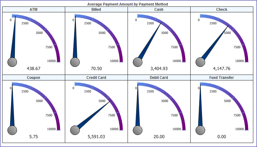
A gauge is a graphical status indicator much like a car speedometer. The gauge displays a needle that moves within a range of numbers displayed on its outside edges. Gauges display the value of a single metric.
You can design up to 12 gauges. Designing multiple gauges provides readers with a way to compare multiple values. Multiple gauges display in a panel similar to the gauge panel in the figure below.
Figure: Gauge Panel
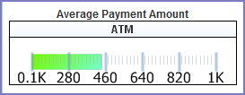
You can choose from three types of gauges. Each type is illustrated in the following figures.
Figure: Gauge Type Radial 1
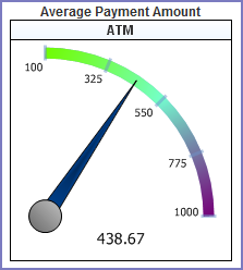
Figure: Gauge Type Radial 2
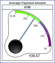
Figure: Linear Gauge
The following table lists and defines the fields and attributes on the Gauges tab.
| Attribute | Description |
|---|---|
| Color | This field can be used to adjust the color
and color gradient in your gauge. Enter a percentage value and the
color you want to use at that point using this format: |
| Continue to Misc | When you finish creating gauges, click this button to move to the next tab and the next set of actions. |
| Gauge Style | This is the gauge style to be used in your report. See Gauge Type Radial 1, Gauge Type Radial 2, and Linear Gauge for illustrations of the different types. |
| Minimum/Maximum | These fields define the range of values to use for the gauge. |
| Name | This defines a field to use for the gauge labels.
Values from the chosen field serve as labels for each gauge you
create. If you have more label values than gauges, Civic Platform
creates gauges for the first x number of labels values sorted in
ascending order, where x is the number of gauges you are creating
as defined in the Results field. Note:
You cannot directly pick which label value to create a gauge for. However, you can use the Filters tab to hide the label values you do not want to create gauges for. See Filters Tab. |
| Results | This is how many gauges you want to show. If you choose to count the number of products in multiple categories, you could specify that you want to only show the first 4 categories by alphabetical order. You can create up to 12 gauges. See Gauge Panel for an example of multiple gauges. |
| Preview | This runs a preview of your report so you can check your report output. |
| Sort/Function | When you create a number of gauges that is fewer the number of available gauge labels, the ad hoc report writer creates gauges for the first x (number) gauge labels, where x is the number of gauges you are creating. This field defines how the ad hoc report writer determines the sort order of gauge labels. For example, if you choose the same field for Sort as you chose for Name, you can apply a function COUNT. You can then turn on reverse sort (z to a) to make the highest count appear at the top of the list. |
| Target Report | This enables you to select a sub-report for your chart. You must create and save a sub-report before you can use it as a Target Report. |
| Title | Enter a title for the gauge or panel of gauges. |
| Value/Function | Choose a field from the drop-down list that represents the value you want to measure with your gauges, then apply a Function to that field that displays the data you want to see. For example, to create a gauge that measures the average payment intake, you can choose AMOUNT as the Value, and apply the function AVERAGE to that value. When the ad hoc report writer creates the gauge, it shows the average payment intake. |
Misc Tab
Use the Misc Tab to add a title, description, header, and footer for your report. You can define what type of justification that you want to apply for each of these elements as well as for the Report Header Image (the logo). The choices are (L) left justification, (R) right justification, and (M) middle/center justification. You can also set permissions for your report, defining whom you want to be able to access your report, and what you want to allow them to do.
For additional reference, see Izenda's Misc Tab documentation.
The following table lists and defines the fields, buttons, and attributes available on the Misc tab.
| Field/Button | Description |
|---|---|
| Description | This is a description of the report. Toggle the Justification button for the Title field to define whether you want the text left justified, right justified, or middle justified. |
| Drill-down Key | This defines the drill-down key for use with a sub-report (as defined in the Target Report field on the Charts tab). |
| Footer | This defines report footer content. Toggle the Justification button for the field to define whether you want your footer left justified, right justified, or middle justified. |
| Header | This defines Report Header content. Toggle the Justification button for the field to define whether you want your header left justified, right justified, or middle justified. |
| Owner | This field identifies the user name of the individual who created the current report. |
| Share With/Rights | These fields define who you want to share the current report with, and what permissions you want to give them when interacting with the report. Select Shared to allow other users to see your report and modify it. Select Read only to set the report so that it is only modifiable by the report owner. Select View Only to allow other users to simply view the report and not make any modifications. |
| Title | This is the title of your report. Toggle the Justification button for the Title field to define whether you want your title left justified, right justified, or middle justified. |
Style Tab
Use the Style tab to customize the look of your table by changing the color of borders, headers, and rows. When you apply new colors, you can see the end result immediately reflected in the sample grid available on the tab.
You can set report properties on this page as well. See the table below for a list of properties and definitions.
| Field/Button | Description |
|---|---|
| Border Color, Header Color, Header Foreground Color, Item Color, Item Foreground Color, Alternating Item Color | This allows you to select a color from for each table element. Refer to the Sample Grid below the Restore Default button to see how the colors you choose, appear. |
| Restore Default | This restores the default color settings for the six color fields. |
| Landscape Printing | This prints your report in landscape page format. |
| Show Page Number | This displays page numbers on PDF output reports. |
| Show Date and Time | This displays the date and time of the report run on PDF output reports. |
| Use Pagination in Webview | This enables readers to see pagination in web view. Normally, pagination is not applicable in web view. |
| Add Bookmarks for Each Visual Group | This adds PDF bookmarks for each visual group. You must have applied the VG attribute to a field and you must print to PDF to see these bookmarks. |
| Page Break after Visual Groups (PDF) | This applies page breaks for each visual group, such that each visual group begins on a new page. You must have applied the VG attribute to a field and you must print to PDF to see this result. |
| Minimize grid width | This trims the width of the columns in your table to match the widest field value, eliminating unused space. |
| Visual Group Style | This style applies to visual groups sub-headers that contain more than one field value; for example, Name and City. You must have applied the VG attribute to more than one field to see this result. |
| Items per Page (in viewer) | This limits the number of rows displayed per page in your report viewer. |
| Report Order | The Move Up and Move Down buttons allow you to change the order in which the different parts of your report display. The order in which the parts appear in this field is the order in which they display when you run the report. |
| Field/Value Column Pairs | This sets the field value style, which can be useful for accounting and financial reports. |
| Show main report in Field/Value Style | This changes the main report table to display in the Field/Value style defined in Field/Value Column Pairs field. |
| Show summary report in Field/Value Style. | This changes the summary report table to display in the Field/Value style defined in Field/Value Column Pairs field. |
| Continue to Filters | When you finish setting styles, click this button to move to the next tab and the next set of actions. |
| Preview | This runs your report and check your report output. |
| Enable Responsive Grid | Check this box to enable responsive grids. For details, see http://wiki.izenda.us/Guides/ReportDesign/12.0-Pivots-in-Izenda. |
| Pivot columns per exported page | Specifies the number of pivot columns on an exported page. For details, see http://wiki.izenda.us/FAQ/Responsive-Grid. |
Filters Tab
Use the Filters tab to filter the data from the data source(s) so that Civic Platform uses only pertinent results in your tables, charts, and gauges.
The following fields and attributes may appear on the Filters tab:
| Field/Button | Description |
|---|---|
| Filter Field | This defines the field on which to filter the data returned from your data source(s). |
| Operator | This defines the operation to perform on the field you selected as the Filter Field. |
| Values | This is the value to which the ad hoc report writer applies the operation. For example, “Begins With A” returns only those records with entries in the filter field that start with “A.” |
| Blank | This defines whether you want this filter to return both data that matches the defined Values and data that has a blank/null value in that field.This control does not affect the Preview view. |
| Param | This defines whether you want to display this filter and the current settings in the Report Viewer, allowing the user to change the filter value. This control does not affect the Preview view. |
| Show Filters in Report Description | This writes a read-only summary of the report filters you created to the Description field for the report. |
| Require X Parameters in Viewer | This option require the reader of the report to set one or more filter values before the report contents display. |
| Preview | Use this button to run your report and check your report output. |
Preview Tab
Use the Preview tab to view a preliminary version of the your report, including any table, summary table, chart, or gauge you added. Return to any of the previous tabs to make changes, then click the Preview button or tab to see how those changes affect report output.
What You See on the Dashboard Designer
Use the Dashboard Designer to add multiple reports for display in a single viewer. When you select the reports to display in your dashboard, the ad hoc report writer prompts you to select which report part to use. You can elect to use the table, the summary, a chart, or gauges - whichever is more useful for your purposes.
Note:
You must create reports before you can add them to a Dashboard display. See Designing a New Report |
The Dashboard Designer contains multiple sets of report selection fields. Each set you define displays a different report in your dashboard. The table below lists and defines the report selection and the permission fields available on the report designer, as well as the buttons available in the toolbar.
| New | Creates a new report and opens the Report Designer. |
| Preview | Previews your dashboard design. |
| Prints your dashboard to your computer’s default printer. | |
| Records | This is the number of records to show; includes All and All (No scroll bar). |
| Report | This is the report you want to add to your dashboard display. |
| Report List | This returns you to the Report List view. |
| Report Part | This is the report part you want to use in your dashboard display. This list populates based on the parts (Chart, Gauges, Summary Detail) of the report you selected. |
| Save | This saves your dashboard. |
| Save as | This allows you to save your dashboard with a new name and/or to assign your dashboard to a category. |
| Share With/Rights | This defines who you want to share the dashboard with, and what permissions you want to give them when interacting with the dashboard. “Shared” allows other users to see your dashboard and modify it. “Read only” sets the dashboard so that it is only modifiable by the owner. “View Only” allows other users to view the dashboard but not make any modifications. |
| Title | This is the title for the report |